Kitchen Renovation: Before and After
My first before and after post highlighting our home renovation! FINALLY. Talk about a long time coming. I’m starting with the kitchen because it’s the focal point of our home and for sure the most dramatic transformation of any room in the house.
First, a little background on our renovation. We lived in our home for about 8 months before demo started in September of 2016. What was supposed to take 8-12 weeks (LOL) ended up taking 8 months. Really even longer than that because 2.5 years later we’re still fixing things our contractors messed up. It’s sort of never ending, but such is the life of a home owner. I’ll only touch on this briefly here, but we did not have a good experience with our builder or pretty much any of our subcontractors and our life during this renovation was pure hell. I’m still recovering emotionally, and no, I’m not being hyperbolic. However, that’s a post for another day in which I’ll divulge all the advice I have for anyone about to embark on a major renovation of their own (pro-tip #1: hire the right contractor). Despite our unpleasant experience, it’s really true what they say.… all the pain and suffering was worth it in the end. We’re thrilled with the finished product.
Below are some before pictures to give you an idea of where we started. I know before/after pictures can sometimes be hard to decipher, especially when walls are torn down and the space reconfigured, so under each before picture I’ve included a caption describing the changes we made for those interested. If you’re just here for pretty pictures, feel free to skip the captions and keep scrolling!

The “Before” kitchen. In all its late 90’s, builder grade glory. This is the angle you see when you walk into our house from the garage. I’m starting with this picture because that wall you see with the upper cabinets on it - that got demolished. It no longer exists. I knew from the beginning it had to come down and eventually convinced my husband to agree with me. Doing so opened up our kitchen to the formal living room and is the change that had the single biggest impact on the space. Now the kitchen has a more modern, open layout and the space is much brighter. For perspective, that wall is now where our big island sits (the island with the main sink and the 6 barstools lining it).

Here’s a picture of the OTHER side of that wall we tore down (aka the backside of the wall you see in the picture above). We also removed those columns (because, ew) and replaced the french doors and windows you see (on the left) with a huge, glass sliding door to let in more natural light.
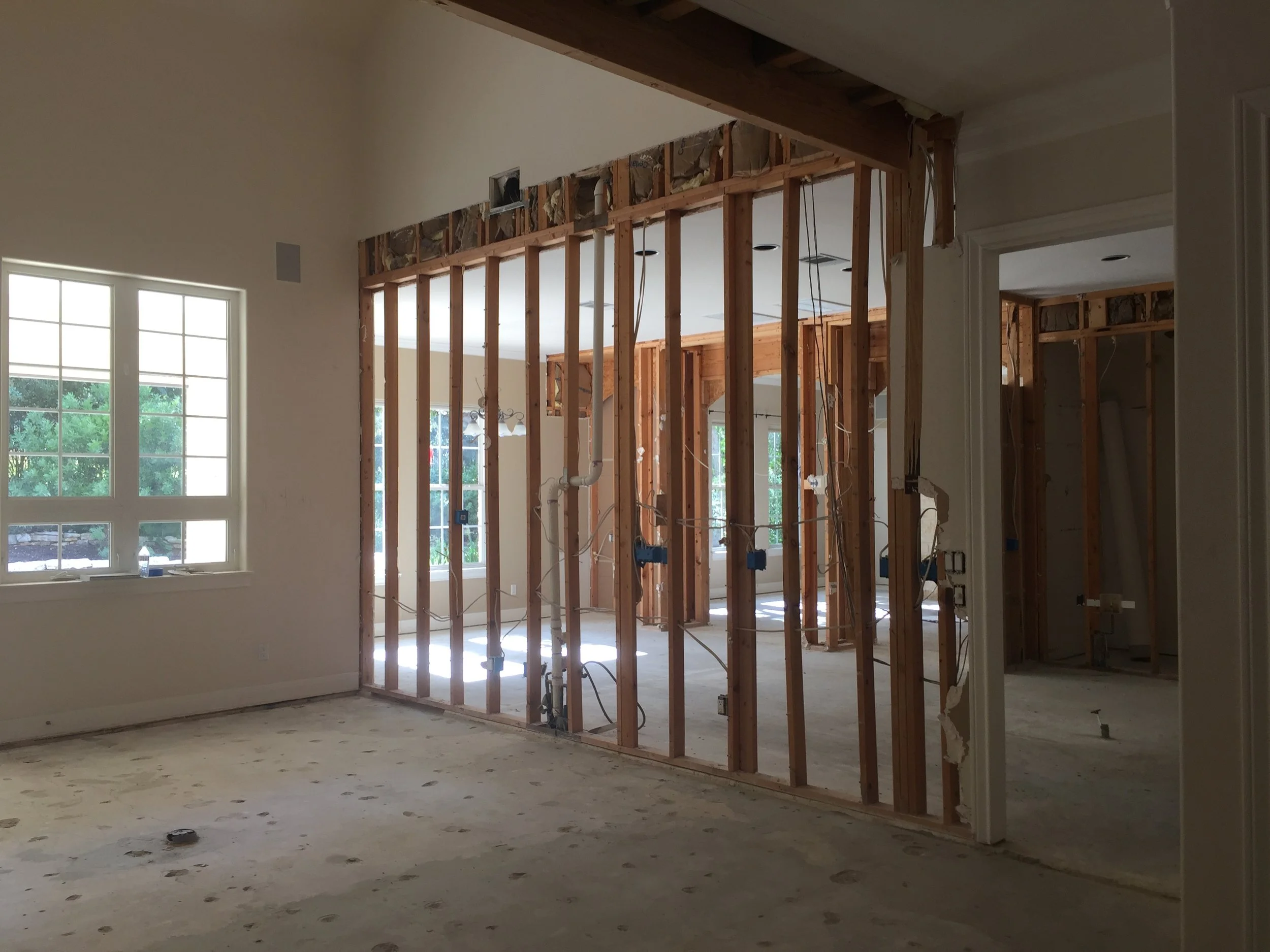
Here we are in progress. This half torn down wall is the same wall seen on the picture to the left.

Yet another angle. I’m standing right next to the wall we tore down and am looking into our breakfast nook (on the left) and family room (through the arches on the right). Where you see the fridge in the picture above is now where our range/oven sits. Also notice the “pass through” directly to the left of the fridge. It served no functional purpose, so we walled that opening up so we could use it for upper cabinet storage. Doing so also served to close off the family room and make it a little more cozy and intimate (which we like).

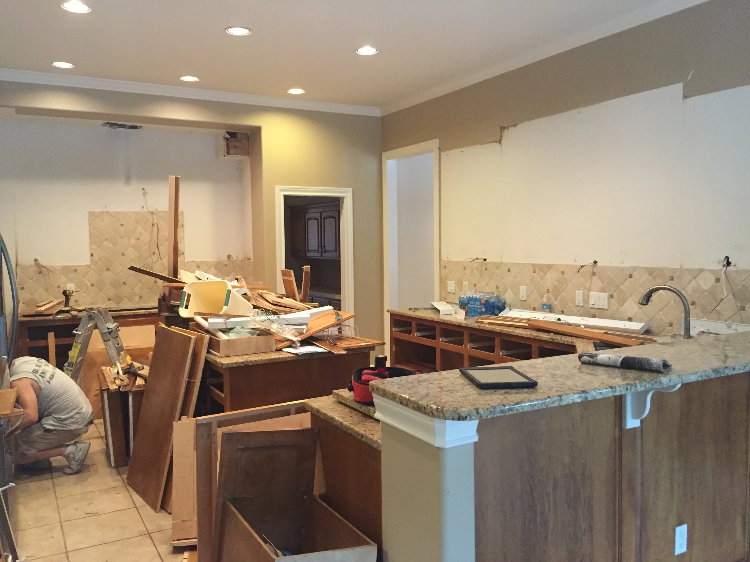
Another angle of the kitchen before. This is the view from our breakfast area. Through that open doorway on the right is the Butler’s Pantry walk through to our formal dining room. The biggest thing to tell you here is that during the renovation we flipped the location of the stove and the refrigerator. Why? Because otherwise the focal point of the kitchen would have been our fridge and that’s a design no-no. You always want the focal point to be the stove. It’s much prettier.

Same perspective as you see in the image on the left, but in progress.
Here we are on demo day. AGAIN…. the wall on the right (with the upper cabinets missing) was torn down.
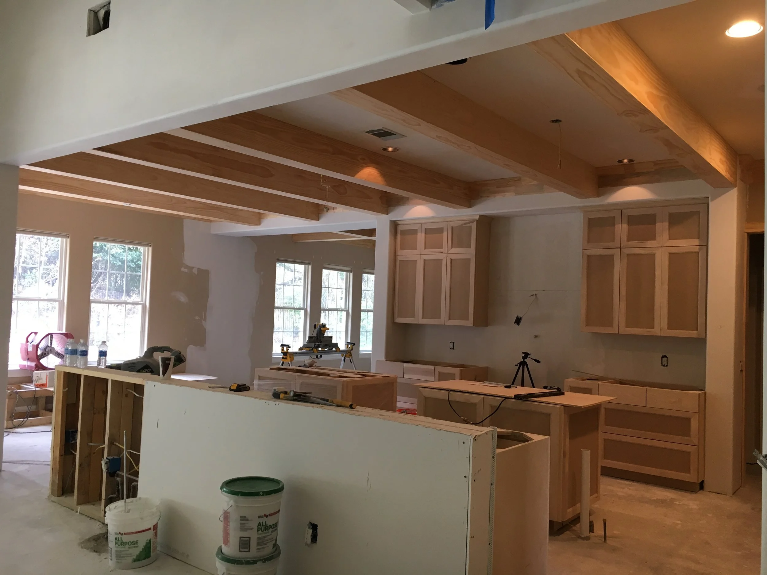
Here’s one final “in progress” picture. I think it helps to see the space in this state as we segway to viewing the finished space. Note that all the arches are gone and all the walls are squared off for a more modern look.
And here’s the final product! HOW IS THIS THE SAME SPACE?! It’s my house, and it’s still hard for me to believe. The transformation is incredible.


I’m running out of time over here and need to get back to my mom duties, so I’ll just briefly touch on some of the design choices. First and foremost, HUGE shoutout (again) to the Heather Scott Home & Design team who helped us space plan and pick the finishes.
At the beginning of the design process, I sent some notes to Heather and included Kourtney Kardashian’s kitchen as one of my inspiration rooms. Similar to Kourtney’s kitchen, we incorporated the double kitchen island layout, the industrial stainless steel Wolf and Sub-Zero appliances, the white quartz countertops, and the dark beams on the ceiling. Heather’s original plan called for a La Cornue range, which I do love, but I wanted a more modern feel + I felt like the Wolf was better resale-wise for our neighborhood.
While our kitchen certainly takes inspiration from Kourtney’s, the final look turned out quite different and much more me. The exterior of our home is a traditional Texas limestone style, so we didn’t want to go too modern. We also made a lot of choices with resale value in the back of our minds in case we decide to move. Overall, I’d describe the style of this kitchen as classic with a modern edge. The classic elements: the white shaker-style cabinets, farmhouse sink, light fixtures, and dark hardwood floors + beams. The modern elements: the backsplash (we ran our countertops up the wall), cabinet pulls, plumbing hardware, and appliances.
Finally, if you want to know specific product details for any of our finishes (plumbing, counters, hardware, lighting, etc.), just ask in the comments and I’ll track down details for you! Our cabinets are painted in Benjamin Moore’s White Dove. The walls are painted in Benjamin Moore’s Classic Grey.
Putting this post together was such a trip down memory lane for me. We love how our kitchen turned out and spend so much time in the space. It truly is the heart and soul of our home. I hope you love it, too!